


Team Solstice
Team Solstice is an esports organization that looks to promote a premier, professional, and accepting community through streaming and local events.
Logo/color design was done by the wonderful Kalle Waganat. The goal behind each animation is to capture a professional and inviting energy.
If you are interested in checking out their content be sure to follow them on Twitch or join their Discord.

Oasis Stinger Transition
Illustration by: Kalle Waganat
Animation by: Parker Simmons
One of the local events that Team Solstice hosts is the Oasis a weekly Smash Bros Ultimate tournament. When talks began about this animation, Team Solstice gave me full creative freedom, supplied me with their logo and color design and let me fly.
The event is based around Super Smash Bros. So I really wanted to hammer that home by making the icon super apparent at the beginning of the animation.
Then from there I wanted the flower for the Oasis logo to bounce out in a friendly/inviting way. Finally the animation concludes by following the circles motion as it shrinks into itself. Guiding the viewer’s eye to the center of the screen.

(Super Smash Bros Icon.)

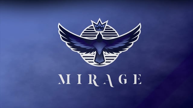
Mirage Stinger Transition
Illustration by: Kalle Waganat
Animation by: Parker Simmons
For Team Solstice’s monthly event “The Mirage” I created a transition that I felt captured a whimsical yet professional energy.

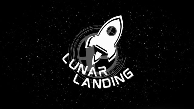
Lunar Landing
Illustration by: Carl Jacobs
Animation by: Parker Simmons
Team Solstice was looking for a energetic transition with character. So I decided to add a few details like the Space Captain getting left behind and The title of the event getting burned by the rocket’s thruster. Just little fun things you can notice each time you watch.
This one was a lot of fun to make and I think the combination of the “almost paper like” illustration and goofy animations really sell that this is an event that is welcoming and fun.
Team Solstice Intro/Outro Animation

When I started speaking with Team Solstice about their intro/outro animation I presented them with two story boards with the goal to capture their brand’s ethos. The first was a more professional slower moving animation where the logo wrote onto the screen and the outer circles still revolved around the main circle. The second animation was much more whimsical and focused primarily on the changing of time and the sun/moon. Ultimately Team Solstice decided to go with the second animation and elements from the first story board were incorporated into the final product.